

")


")

")


 2021")


Notes on Prints and Pulp Paintings
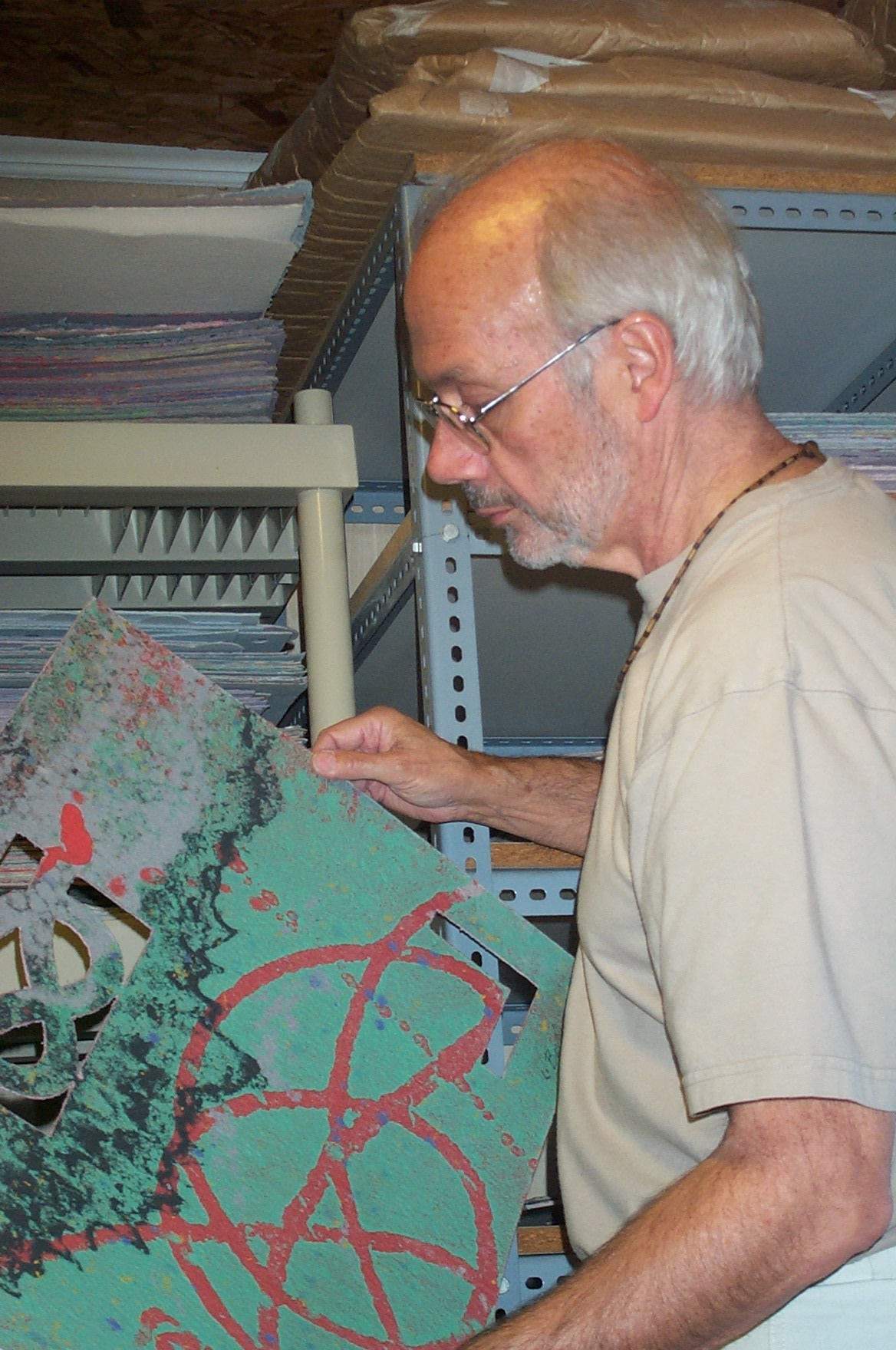
As both printmaker and papermaker my principle concern over the years has been to complement the printed image with esthetically active paper. Many years ago I made shaped paper for woodcuts and lithographs, but for a long time now I have been using different pulps as a way to add color and design to the printing paper. I have also turned this around by making printed images of a rather schematic nature to support and complement pulp imagery. A cardinal point, which is no less important for being obvious, is that the dual role of paper is never denied: it can perform as art medium and, never losing its historic function, simultaneously serve as support or substrate.
As no two printing papers will ever be alike, I consider each impression to be a variation. Thus, in a variable edition of twenty-five, for example, I accordingly sign each print “Var. I / XXV, Var. II / XXV… Var. XXV / XXV.” Titles are written on the back of all my art work, both prints and paintings. Due to the nature of the coloring of any particular paper, there may not be a clear space to write edition number, signature and date on the front. In these cases I sign a “B.” somewhere on the front and sign on the back variation number, title, signature and date.
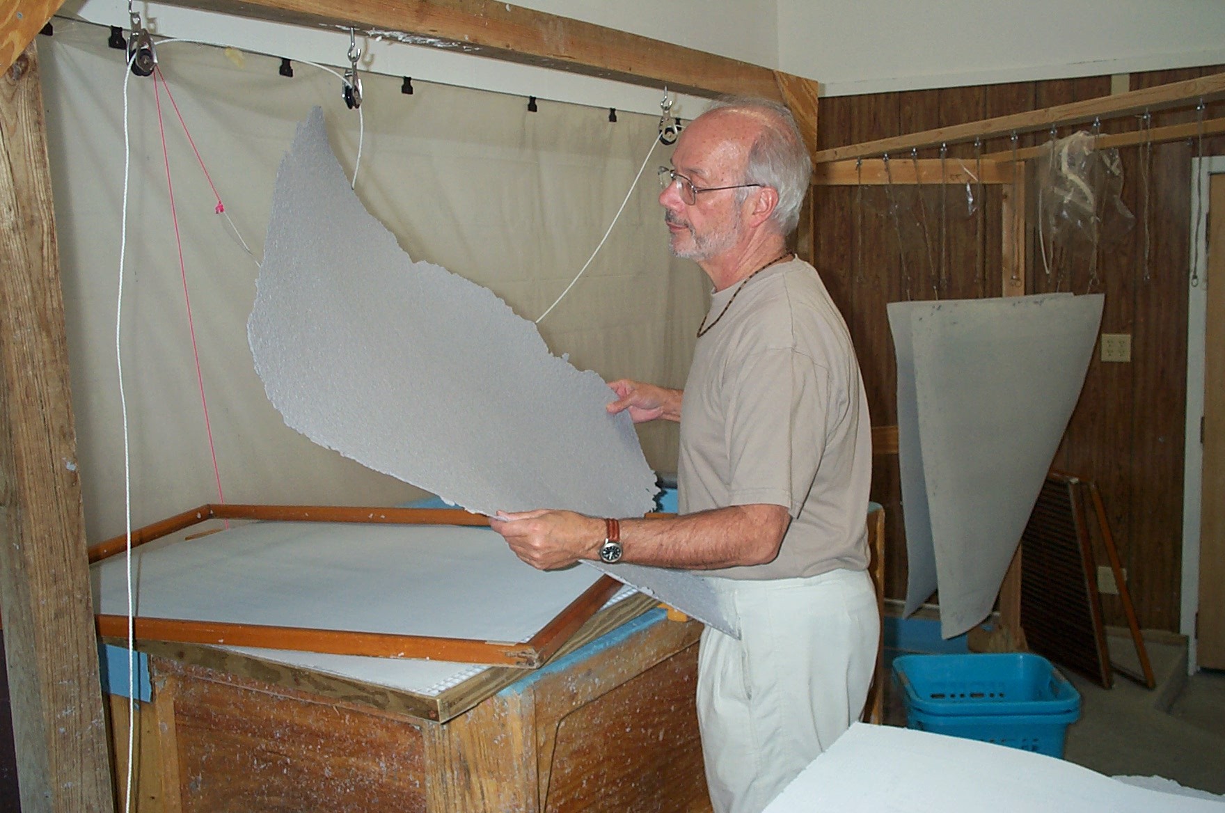
The ability to shape paper is achieved in my case by the use of perforated protective stencils through and around which exposed pulp is washed away. But if a particular stencil is used two or more times should the work be treated as an edition? The shape is being repeated but the painting or the coloring of the paper is unique from one interpretation to another.
Throughout history and despite notable exceptions the default format for the fine arts is, of course, the rectangle, that most stable and neutral of shapes that best serves almost all painting and drawing. The thought of editioning unique paintings on rectangular paper would strike most people as ludicrous. But what happens when the rectangle begins to be tampered with – funny corners here, perforations there? The quiet geometry of the rectangle is easily disturbed as it is altered on a sliding scale of distortion. The resulting gestalt rather quickly trumps that of the painted image, especially when the paper itself becomes pure line, pure drawing. Painting is then decidedly subservient to shape.
I very often title my pieces with thought to their shape and use the same title from one interpretation or variation to another. In order to indicate uniqueness I indicate the number of the variation after the title between parentheses. Thus, for example, “Persian Corners (two)” indicating a second version of that particular shape. Or (five) or (ten). As the spirit moves me I may pick up any one of my stencils to make further copies (of shape), new interpretations. “Open-ended with no particular commitment” probably best sums up my feeling in the matter.
A final note on the signing of prints and paintings. Prints: a single date after my signature means both etching plate (or whatever the matrix may be) and paper were made in that year. A double date such as “2001/00” or alternately “01/00” would mean the plate made in 2001 and was printed on paper made the year before. “01/03” would indicate the matrix was made in 2001 and printed on paper made two years later. Shaped paintings: with double dates the first year indicates the year the paper stencil was cut and the last, the year of the paper or execution of the piece.
I don’t mean to introduce gratuitously overly elaborate procedures for the titling and dating of work, but I do feel the need to come to grips with the implication of the role of active paper and mark its evolution in my work.
All measurements in the above gallery are in inches and (centimeters) with height preceding width.